


Responsive recruitment websites are a must
For some time now, all websites built by Strategies have been truly responsive, but many leading recruitment websites are yet to take advantage of the cutting edge responsive website design (RWD) functionality to adapt a site instantaneously for easy reading and navigation on any size device or screen.
A responsive website gives complete user friendly browsing by reducing the need for resizing, panning and scrolling allowing the visitor to concentrate on content and goals. With a responsive website the content and images flex and respond to screen size to “fill” the available medium but retain the original appearance of the website. There are literally hundreds of viewable screen sizes on the market, with many thousands of devices, from smart phones to tablets, PC’s and notebooks.
Here’s an infographic published by LinkedIn earlier this year which really sums up the need for a mobile and responsive solution and some of the key facts summarised for you:
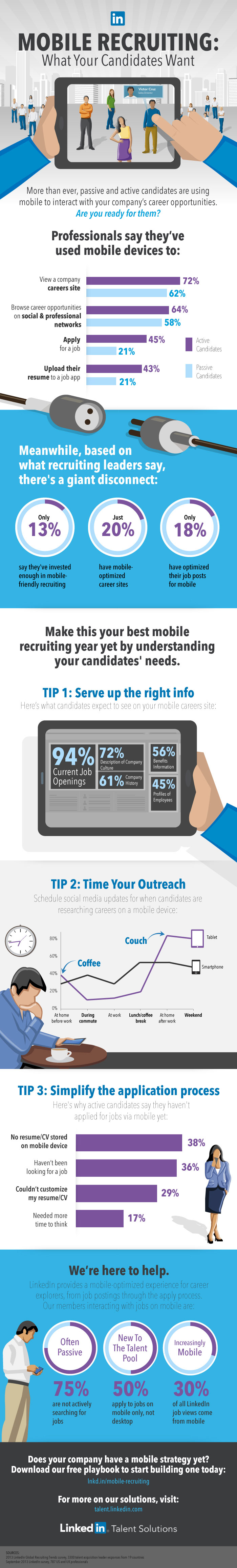
Only 13% of recruitment leaders say they have invested enough in mobile technology and just 20% have mobile optimised sites.
64% of active candidates use mobile devices to browse for opportunities.
At Strategies we combine a full recruitment website with total responsiveness and our cutting edge “JobWeb” technology to deliver the complete “on the move” service today’s candidates require from their recruitment firm.
Are you in the 80% of recruitment agencies without a responsive or mobile website? Call Strategies today and find out just how fast we can change that for you.
https://talent.linkedin.com/blog/index.php/2014/02/mobile-recruiting-statistics-infographic


