


5 Top Tips for UX and Engagement for Mobile Recruitment Websites
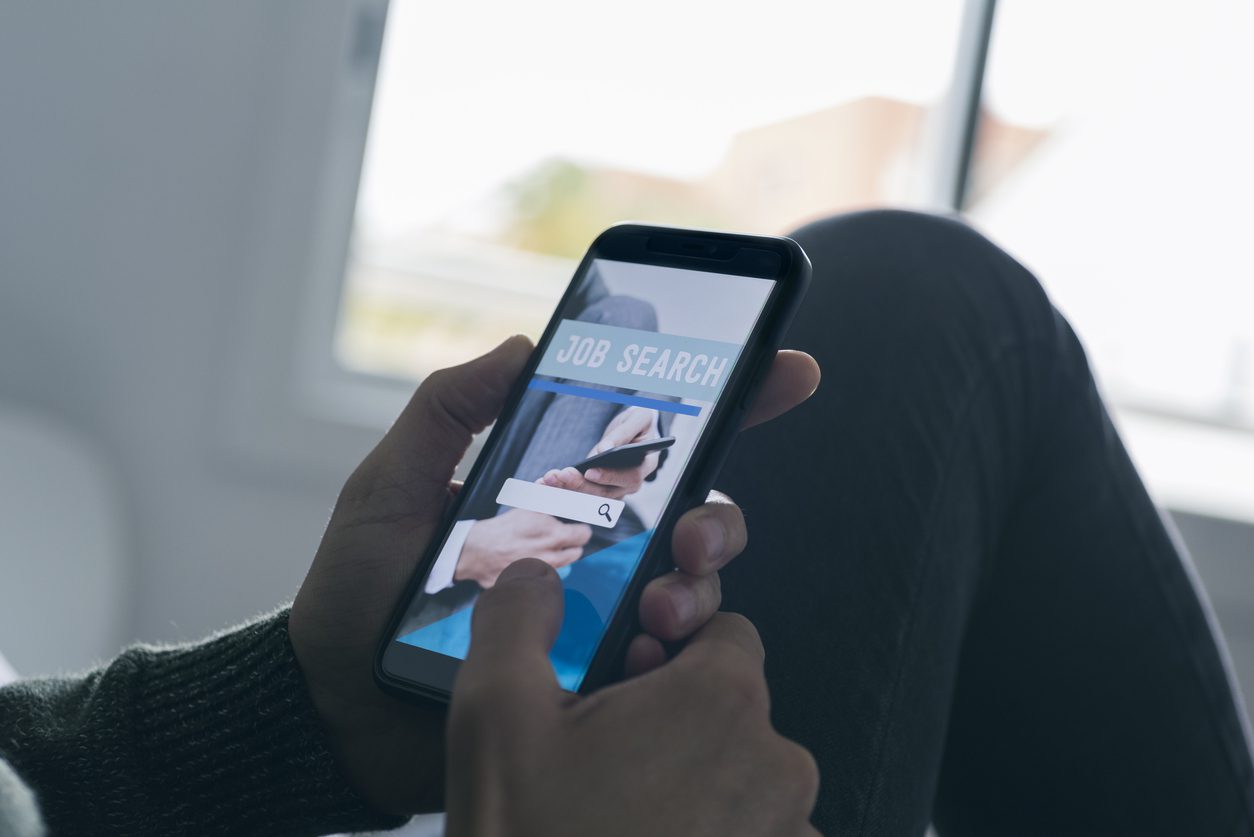
With 45% of job seekers searching for jobs on their mobile device it is more important than ever that all website pages are optimised for mobile users, so you don’t miss out on potential candidates. Here are 5 ways you can optimise your site for stronger UX and higher engagement for your mobile recruitment website:
Full width and chunky buttons
With mobile websites, it’s important that clickable areas are as easy to press as possible, this will not only draw more attention to important areas but also make the overall UX far smoother.
Make it feel more like an app opposed to a website
It’s easy to spot when a website has just been shrunk down from a desktop design, the goal is to show as much information as quickly as possible without the need to scroll excessively.
Draw attention to clickable or important areas with smooth animation
The use of smooth view port animation has been proven to draw more user engagement vs mobile websites with no view port animation. This is simply the way that text, images or general content areas enter your screen.
Reduce your overall text length
At times you can get away with having multiple paragraphs of text on a desktop website, however when looking at the same on mobile you may as well be reading a book. It’s important to cut text down to get straight to the point. This text should be presented differently to your desktop version.
Ensure your job adverts have fixed application and/or search job buttons
Fixed buttons mean that they are always visible on screen, as you scroll down the page they follow you. This is so important because it means the moment the user is ready to apply, the button is there. There is no searching for it when it can’t be found which can cause frustration. As with all of these points, the aim is enhanced UX.
At Strategies, we offer premium non-templated designs that are done from scratch, for both desktop and mobile – during the discovery process we can establish with our clients what device would be best to design for first.


